


As this project is all about speaking from experience we started this project by looking at our personal experiences to see what ideas we could generate.


We then had to come up with 3 messages and 3 problems, this was really useful to do as it abbled me to pin point messages and problems that I think would work well.
I have chosen to look into motivation as my problem, as this course needs 100% motivation otherwise you will fall behind.


Statement of intent:

Research:


Above is a selection of the visual research I have been doing. I've been looking into survival kits and found some really interesting ones. I find it fascinating how much stuff is able to fit into each kit, and the variety of items in each kit.
To make sure that what I am aiming to do is relevant to my audience I have decided to do a survey for this years first years to see what their opinions are on motivation,


From the survey it was clear to see that motivation is definitely an issue and is the start of a slippery slope of getting behind and stressed.

I have also been researching ways of staying motivated, most of what I found online was about how to stay motivated for dieting but what they were saying could also be applied to getting motivated for graphic design. Above is a collection of the research I have done so far.
We had a crit at this stage and the feedback I got on my idea was all good, everyone agreed that motivation was an issue and something that needs to be helped. They said that the main feeling they got from lack of motivation was stress and that stress also bring on the lack of motivation so I know now that one of the things I need to focus on is ways of de-stressing to get the motivation back up.

Above is the further research I have done on ways of relaxing, ways of feeling happier and ways of getting your motivation back up. I can now try and interoperate this things into my motivation kit.
Possible outcomes:

Above is what i imagine my kit to have in it at this stage. Each item has been researched to back up that it will help in someway either motivate or de-stress you which will intern then motivate you.
Crit feed back:


I found this crit really useful as it was a good opportunity to check that the message you are trying to convey is coming across. The areas I now need to address are that the contact may be a little too girly, I have strong research but should now concentrate on experimenting with mockups etc and also need to decided on a method of delivery.
As this is going to be our final crit group here is a list of things we expect to see at the final crit:
1. 5 concept boards
2. Final product/ mock up of idea
3. Clear evidence that you have looked into crit feed back
4.updated blog
5. 5 things you think have worked about your work and 5 things you would improve on (mini evaluation)
Logo/name:

I started designing by looking at what the symbol is for a first aid kit, and emergency services etc and tried experimenting with how I could make the emblem look more directed at design students. I then realise that this is relying too much on the students recognising the logo so decided to move on from this idea.

I then thought about calling the kit 'Keep smiling' as that is what you have to do you have to just keep going and stay as positive as you can if your motivation goes. I experimented with possible imagery, but once again decided this is not the kind of message I want to give as 'keep smiling' could be seen as 'grit your teeth and bare it' where as I don't want people to just bare it I want them to learn to come out of motivation slumps.
I have now decided to go for the name 'MAN UP' as this is how I feel you should act when you feel un motivated, as it may feel like it takes over your whole body, but you just need to man up and put your mind to it and over come it. I also thought that as this name is quite masculine it may address some of the crit feed back about it coming across to girly, I now feel it is more neutral then one gender orientated.

For the logo I have experimented with a few fonts, and have decided to go with Futura condensed medium as it gives a strong bold feel which compliments the title and the imagery.
Design experiment


The colour I have chosen is the violet colour above. I have decided on this colour as it reminds me of the colour of lavender and that is a calming oil and smell and I want my box to have that effect on the mind.
Products I intent to make:
alphabet chocolate
candle and matches
smile booklet
picture frame for inspiration
stress ball
motivational cd
tea bag
Candle

To make the candle I am going to use a transfer paper that is suitable for candles and therefore not going to explode.
I decded to experiment with two candles a large one and a smaller one. The larger one was difficult to apply the transfer to, although I do prefer the dimensions and size of the larger candle the smaller one was a lot more successful the transfer went on without a glitch, and I am happy with the way it looks.


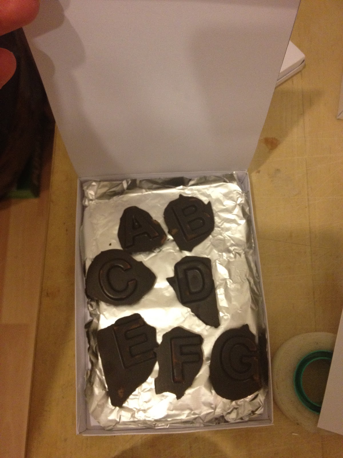
Chocolates:
To make the chocolates I have melted chocolate in a bowl and then left it to set in the fridge in an alphabet ice tray this was the result:

The lettering came out well but the type of chocolate I used did not work out so well as it just kept melting every time your touched it which is never a good thing. When I make the final chocolate I will use a darker chocolate as this will be longer lasting and not melt.
Stress ball:


Using the same paper as for the candles I was able to transfer the image of the logo to the ball.


Further design development for the rest of the products:


frame:


Matches:

Tea bag:


Cd

To do list notebook


Fnal crit

Products ready for crit mius chocolates as it is is too warm to bring them in they will just melt and make a mess.
Crit feed back:


The crit feedback I got is that I could make something in the content of the kit more aimed at design, I agree with this feedback and had played with the idea of including a to do list making notebook for designers, and now that I know that it is necessary I will continue to produce this. I also got feedback on that i need a lot clearer design boards, this I also agree on as the ones I had for final crit where very rough I will take on the advise of how I could approach the boards and make them.
In the crit there were no comments about the presentation of the products in the box, although no one mentioned it, I feel it is something that needs addressing as it looks like a mess and makes the content look confusing. I will look into ways of organising the content. I also need to address the box as although the one I presented for the final crit was just a mock up and not the final thing, it did highlight to me how important the right stock is for such things as boxes.


No comments:
Post a Comment