Friday 31 May 2013

PPP2 : OUGD502 EVALUATION


What skills have you developed through this module and how effectively do you think you have applied them?
Throughout this module I feel like I have developed many skills such as how to effectively evaluate other design practices looking more at the business side of things. I have also developed skills of networking, I feel more comfortable approaching people and talking about design. I feel like I am almost ready to dive in and go for placements which is a massive step up from the beginning of this module. I feel I have a better grasp on the industry and a better grasp on the business side of the industry. This happened throughout Lifes a pitch, where we invented our own studio and how to propose it. I also feel like I have developed my presenting skills throughout this module as we have had to talk about quite complex things to do with business, something I am not familiar with where as normally in presentations we talky about design something we know about. So this was a challenge, but a good challenge that I have benefited from.

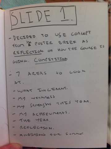
What approaches to/ methods of idea generation have you developed and how have they informed your design development process? 
I think this year the penny has dropped about how important concepts are, it has been drilled into us, for the the better, during second year and I think it has made my work have more meaning and more purpose.  The fact that we are all coming to terms with that we are all each others competition has really made things heat up towards the end of the year, everyone is trying so hard which is a really positive thing, and everyone is pushing themselves really hard, this has abbled me to come up with more creative ideas because I think deep down in my sheepish hear, I do want to stand out and have my work noticed. So I am definitely going to continue with the idea generation method of the 'concept' and also make it as creative as possible.

What strengths can you identify in your work and how have/ will you capitalise on theses? 
I feel that my researching skills have come along this year and that I have enjoyed pop allot more. I am happy with the knowledge I have larnt and the branding that I have done for myself. I am going to continue with developing my research skills as It really helps inform the practice, and  ands meaning to work. I need to start using pop blog to upload things that I have seen as it PPP blog is just pop its so clear and simple compared to the other blogs where there are 5 projectors going on, so its been a really good blog for reflection, which I will take into 3rd year

What weakness can you identify in your work and how will you address these in the future?
My weakness in this module has been that I havnt used this module /blog  to its full benefits. I should have started visiting studios ages ago and setting up all of the networking bits, but I let the other modules get ontop of me and neglected PPP, which is a shame because I really do think this is such a beneficial and important module. I also really need to start bloggin more and doing the tasks when they are set, as they are useful for reflection and development for me  as a future practicing designer. 

Identify five things that you will do differently next time and what do you expect to gain from doing these? 
- Manage time better, and make time for ppp even if it doesn't seem possible
- Visit more studios, so then I'll get more placement opertunitys
- Be more brave with networkings, approach people, this would give me more opertunitys and contacts.
- Document things that I see and find that influence me as they happen, this way the pop blog would turn into more of a reflective journal.
- Work on analytical tools so that I can reflect on practices and designers better, and gain more from them.


How would you grade yourself on the following areas.

5= Excellent 4= Very Good 3= Good 2= Average 1= Poor
Attendance: 4
Punctuality: 5
Motivation: 3
Commitment: 4
Quantity of work produced: 4
Quality of work produced: 3

PPP2 : PRESENTATION


PPP2 : SNKM finished


I am very happy with my overall branding, I have represented myself how I wanted to and would feel comfortable showing my branding to someone. I am going to spend some time over summer applying this branding and making the actual products. I might even send them out for real. I will write up my responses during summer on my PPP blog. which will also help me stay in the blogging mode frame get some practice in before 3rd year kicks off.

PPP2 : OWN BRAND web

Website source:


This above website was my main source of inspiration when thinking about how I wanted my website. I really like how simple and clean it is, and will represent this in my own website.


Website :

This is how the index page of my website will look. It has all of my design work on it which you would find by scrolling down. By having the work on the first page It will ensure that my audience has seen the work easily and doesn't have to waste time search or going through things. The navigation for this website would also be just as easy to follow.


To see more images from a particular project you would hover over the project and an arrow pointing which ever way you want to go will appear.


Once you click on that arrow it will bring up the next image of the series.


There is also an Info button which is available for you to press if you want to find out more information about the project.


The next page would be the contact page which will be kept simple and to the point. Easy to find the information and easy to find the links to other social media platforms.


For shop and more I would not need to code the pages as they would link to other internet sites the shop would link to a shop website soon as I've set one up and got things to sell! and the More will link to a personal blog probably filled with dogs, so the audience can feel like they know me a bit better.


I think as a website this proposal will work well. It is my aim over summer to get back into coding and create my website. This one would work well as it is easy to use for the audience so will mean people will stay on the site and look at my work.

PPP2 : task 8 : part 2 Creative cv & pack

Creative CV:


This is my creative CV. I had to be selective with the information I put on it as I did not have a lot of space to work with.


I started off playing with the logo landscape but decided against this as the CV will work better portrait.


The above is the mocked up version of what my CV would look like. I am happy with it I think it represent the concept I am putting across and once it is screen printed for real it should have a really lovely tactile finish to it.

Inside the match box:

To add an element of humour there will be cheesy one liners about sparks and matches etc. This will hopefully lighten the mood and show a bit of my personality 

Work examples :


This is a booklet that will fit inside the match box and will include examples of my work. They won't be very big, so hopefully this will entice the designer to look on my website to see more.

A business card will also be inside the match box.

I am happy with my design pack / Creative CV, I think it represents me well as i've tried to be creative with my concept, whilst keeping everything else as simple as possible. Im really excited to see what it will all look like once it is screen printed.

Injet Mock UP :


To get a feel of the CV i decided to inkjet print the cv just as a mock up. I am happy with the result. I think the colours look really bad due to not being anywhere near the pantone I selected but once I Screen print it should be the perfect colour. 


PPP2 : OWN BRANDING

Font Choice:

I wanted a typeface that is strong but not too in your face I used Wordmark to load up all my fonts so I could see which fits the best .


 I have decided to go with the font Brandon Grotesque.


It is a strong but not to over the some typeface, so it will stand out but just the right amount.


Colour selection:


Through looking on my cargo collective and looking at the work I have done this year I noticed I have love of the good old pastel colour, I seem to use it in most projects unbeknown to me. I do love pastel colours so I quite like the fact I have been using them in projects. And for this reason and realisation that I am going to continute the pastel theme into my branding.


These are the computer rendered versions of my scribbles using the sleeted font and selected colours.


I was trying to find the one style the I think best suited me. ( the reason for the line came about when I looked and realised i am constantly covered in dog hair, so the lines are the dog hair. This is completely conceptual and none will notice and realise, it was just the spark for the idea) I decided that as I am not about one style of graphic design I like to mix things up i think concept and appropriateness for each individual brief is more important then 'style' and 'trend' so because I like to mix it up I am going to mix my business card up and have 5 varying logos.

Back :

On the back I didn't want to be just a designer I wanted to inject a little fact about myself too:


Screen Print:

I really love screen print so feel it is appropriate for my identity to be screen printed. Another reason is due to the colour I have chosen, They are pastel spot colours so the best way for me to represent them is by mixing the colours myself. I am going to screen print my stuff during the summer ASAP

This is the preparation of the art work for print.


Mocked up:


Now that I have my Buisness card and logo I can apply it the website and also my creative cv